
GasNet
We are gasmen,
we are GasNet
We are a distributor of natural gas. We take care of the biggest
gas network in the Czech Republic, which delivers life-dependant source of energy for millions of people. We take care of natural gas reaching the Czech households and businesses safely and reliably every day.
We believe in the future of gas. We want to be a pillar of modern and green energy. We will therefore implement digitalisation, innovation and new
technologies. Because we care about our common future, we act with consideration, sustainability and responsibility: to each other, to our surroundings and the environment.
Our strategy
With our new brand, we deliver safety, reliability and respect through the stories and faces of our people – the professionals from the GasNet group.
Tone of Voice
Logo design
Our brand reflects who we are. The design is composed of precise, geometric shapes with the same precision and professionalism with which we build and care for the distribution gas network. The letters gn are drawn in a single stroke, which symbolizes the basic element of our infrastructure, our business - the gas pipeline.
The brand stands for strength, pride, confidence and friendliness.
View presentation
Logotype
GasNet is a high-tech company so the visual separation of the two words in our name is done with machine-like precision. The logotype was designed with the same principles as the symbol.
Basic variant of the logo
Basic design
The logo as a whole, consists of two basic elements - a symbol and a logotype. These elements can have different relative positions and scales and thus create a variable application system for different conditions and purposes.
The symbol and logotype are primarily used together but can also be used separately under the conditions described later in this manual.
In some occasions it is allowed to use logotype and symbol separately while following these basic rules. We always take into consideration the whole format area. We should include both (symbol and logotype) in the space of an application. If we find the application format significantly horizontal or vertical, we can use the symbol as a graphical element and even let it bleed out of format (in that case we prefer to bleed from right side of the format). We can even swap the scales of the elements and make logotype dominant while symbol is just a smaller mark placed top right from the logotype.
Basic variant of the logo


Main colours
The strong green colour gives our visual identity positive energy and underlines our focus on sustainability and the environment. The main colour is complemented with shades of grey.
The colour specifications below are binding and their change represents a completely undesirable interference with the visual identity of our company. In the basic variant of the logo, we also use colour gradients.

GREEN
RGB 64 196 0
CMYK 74 0 100 0
HEX #40c400
PANTONE 802 C
RAL 6018

SHADES OF BLACK
RGB 229 229 229 - 0 0 0
CMYK 0 0 0 10 - 0 0 0 100
HEX #e5e5e5 - #000000

WHITE
RGB 255 255 255
CMYK 0 0 0 0
HEX #ffffff
Doplňková barva

RGB 255 128 0
CMYK 2 49 92 0
# ff8000
PANTONE 151 C
Gradients
Thanks to the use of colour gradients, the logo acquires depth and appears three-dimensional. Variants of the logo with gradients are the basic and preferred form, which we use wherever it is technically possible (online and in classic digital and offset printing).
Where the technology does not allow reproduction (display, print) the gradient, it is permissible to replace the basic logo with a variant without a gradient. Such as making a logo from 3D material, embossing, flexographic printing or printing the logo below the recommended minimum size (e.g. sponsor strips) for example. For black variants of the logo with a gradient, we work with a grey scale to achieve a sufficient contrast of the black shadow in the gradient.

RGB 64 196 0 - 36 126 44
CMYK 74 0 100 0 - 85 10 100 10
HEX #40c400 - #237d26

RGB 102 102 102 - 51 51 51
CMYK 0 0 0 60 - 0 0 0 80
HEX #666666 - #333333

RGB 255 255 255 - 102 102 102
CMYK 0 0 0 0 - 0 0 0 60
HEX #43a729 - #666666
Basic variant
Our brand is original, we care about our brand, how it represents our company, and we want it to be used as intended.
In the basic variant, the logotype is located inside the symbol space. We use this solution wherever possible. Only if, from the point of view of legibility or application restrictions, the placement is impossible or obviously inappropriate, is it permissible to use secondary variants of the logo.
Logos to download


Secondary variants
Vertical
This variant is intended only for applications that do not allow the use of the basic variant of the brand. Here, the logotype is placed directly below the symbol, and thus allows the application of the logo even if there is insufficient space for the basic variant of the logo.
Logos to download


Horizontal
This variant is intended only for applications that do not allow the use of the basic variant of the logo. Here, the logotype is placed directly next to the symbol, and thus allows the application of the logo even if there is insufficient space for the basic variant of the logo.
Logos to download


Buffer zone
The buffer zone is the minimum distance of the logo to other objects in the layout. If we place the logo in an imaginary rectangle, this distance is equal to twice the thickness of the line of the "gn" symbol. In case of logotype we consider it to be the width and height of the letter "a". The buffer zone set in this way applies to all logo variants.


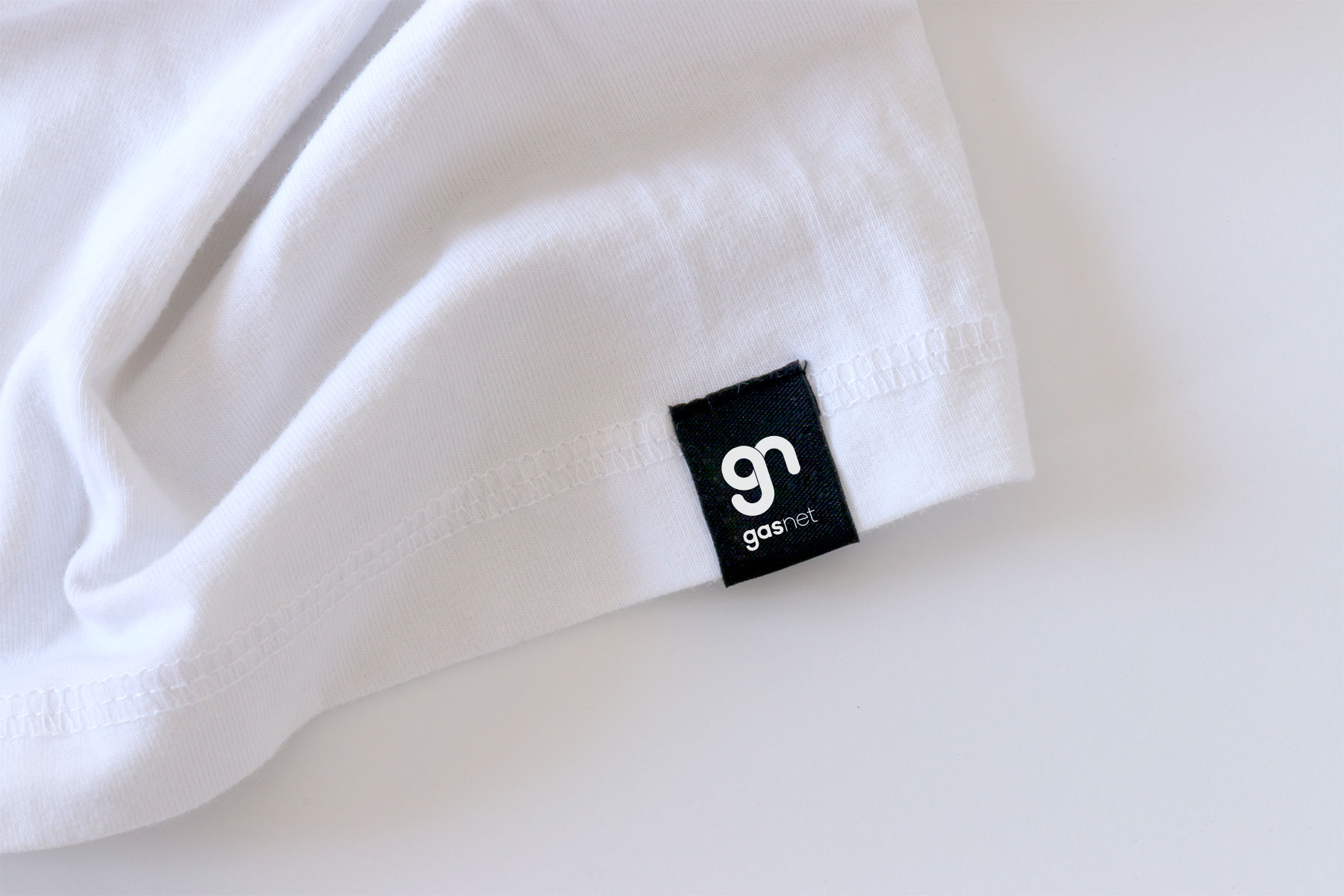
Minimum size
The minimum size allowed for the full variant of the logo in print is 15 mm vertically. In a digital environment, this size is 70 px vertically. The symbol itself allows printing from 10 mm vertically and digital display from 25 px. The minimum size of the vertical variant of the logo is 15 mm / 70 px and the horizontal variant is then 7 mm / 35 px.

260px
130px
100px
70px
260px
130px
100px
70px
50mm
25mm
20mm
15mm
50mm
25mm
20mm
15mm
200px
100px
50px
25px
200px
100px
50px
25px
80mm
40mm
20mm
10mm
80mm
40mm
20mm
10mm
Prohibited use


It is forbidden to create new colour variants of primary and secondary logos. Corporate green, white and grey-scale are allowed.

Arbitrary grouping of the symbol and logotype, including changes in the size ratios of individual elements, is not allowed.

Combining different colour variants of a symbol and a logotype within one logo (one application) is not allowed.

It is necessary to observe the aspect ratios of each of the logo variants. Disproportionate enlargement / reduction of the logo, is prohibited.
The logo must not be placed on an insufficiently contrasting background. If we apply the logo to a photograph, we choose a variant of the logo that ensures its best legibility.
We do not apply the logo on backgrounds that are not in the company colours. We always choose a suitable combination of white / green / shades of black for the logo and its background.
Typography
Company font
The geometrically designed Fieldwork font is an ideal companion for the round shapes and geometric construction of the logo based on circles. This font comes in a wide range of cuts, from very thin to bold and extra bold, contains the Latin 2 character set for typesetting in the Czech language and is suitable for both print and digital publishing applications.
The font is available through AdobeFonts.
How to produce a layout
Fieldwork
abcdefghijklmnopqrstuvwxyz
abcdefghijklmnopqrstuvwxyz
0123456789.,-+*/=%@!?#&
abcdefghijklmnopqrstuvwxyz
abcdefghijklmnopqrstuvwxyz
0123456789.,-+*/=%@!?#&
abcdefghijklmnopqrstuvwxyz
abcdefghijklmnopqrstuvwxyz
0123456789.,-+*/=%@!?#&
Online fonts
Supplemental to the company’s chosen Fieldwork font, we also have an additional font for the presentation of the brand in the online space: Nunito Sans (Google Fonts) freely available and is intended primarily for small and paragraph texts, as it has excellent readability on screens.
Get Nunito Sans from Google Fonts
Nunito Sans
abcdefghijklmnopqrstuvwxyz
abcdefghijklmnopqrstuvwxyz
0123456789.,-+*/=%@!?#&
abcdefghijklmnopqrstuvwxyz
abcdefghijklmnopqrstuvwxyz
0123456789.,-+*/=%@!?#&
abcdefghijklmnopqrstuvwxyz
abcdefghijklmnopqrstuvwxyz
0123456789.,-+*/=%@!?#&
Substitution font
Segoe UI as a substitution font is intended for internal and utility publications only. This font is default in Windows libraries, ensuring trouble-free use without the need for font installation.
Segoe UI
abcdefghijklmnopqrstuvwxyz
abcdefghijklmnopqrstuvwxyz
0123456789.,-+*/=%@!?#&
Illustrations
Pictograms
The set of symbols is based on the design principles of the logo itself. These graphics consist of a simple line with shaded detail that indicates spatiality. Iconography thus complements the visual identity with a distinctive, original, and easily identifiable element.For standard use, the basic – thin - style of pictograms is suitable. For the application of miniature symbols (below 40 px / 1.5 cm), a thicker style is more suitable.
Pictograms for download


Creation
When creating new symbols, we pay attention to maintaining a uniform appearance of all corporate-identity graphic elements. Here is a brief summary of some of the rules:

Stroke
Symbols are made up of strokes, not spaces. The ends and edges of all lines are always rounded. The stroke must be of the same force as the stroke of the symbol on a comparable scale.

Shadow
As in the logo itself, we use a gradient on a black scale in the derived graphics. This gradient forms a shadow indicating the layers and their overlap. Location of the gradient is on the vertical axis or at the connection point.

Direction
If we imagine that the circle symbol is formed by one line, then we place the shadow as if the line were drawn clockwise. We create complicated shapes individually according to the specific situation.

Level of detail
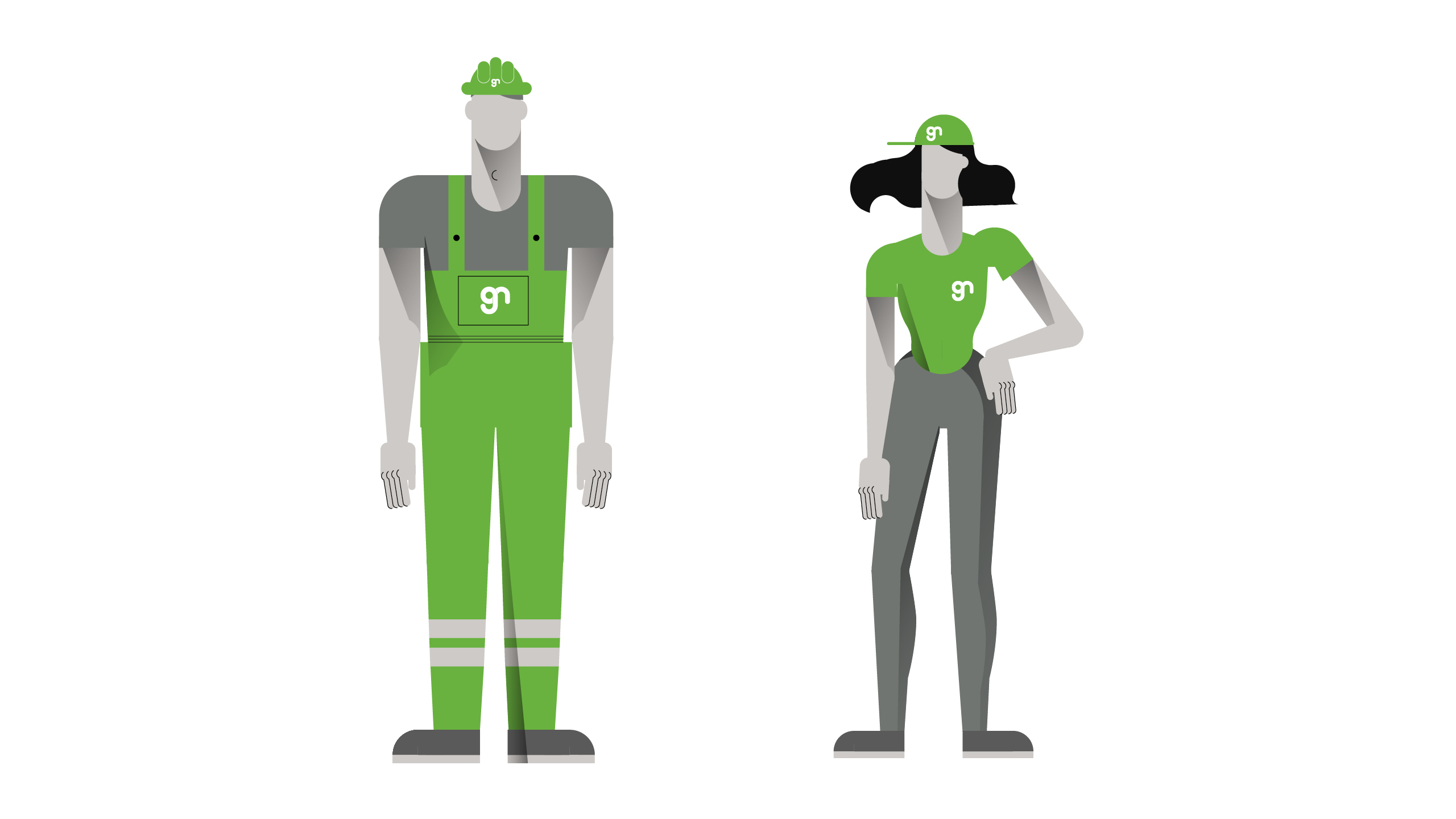
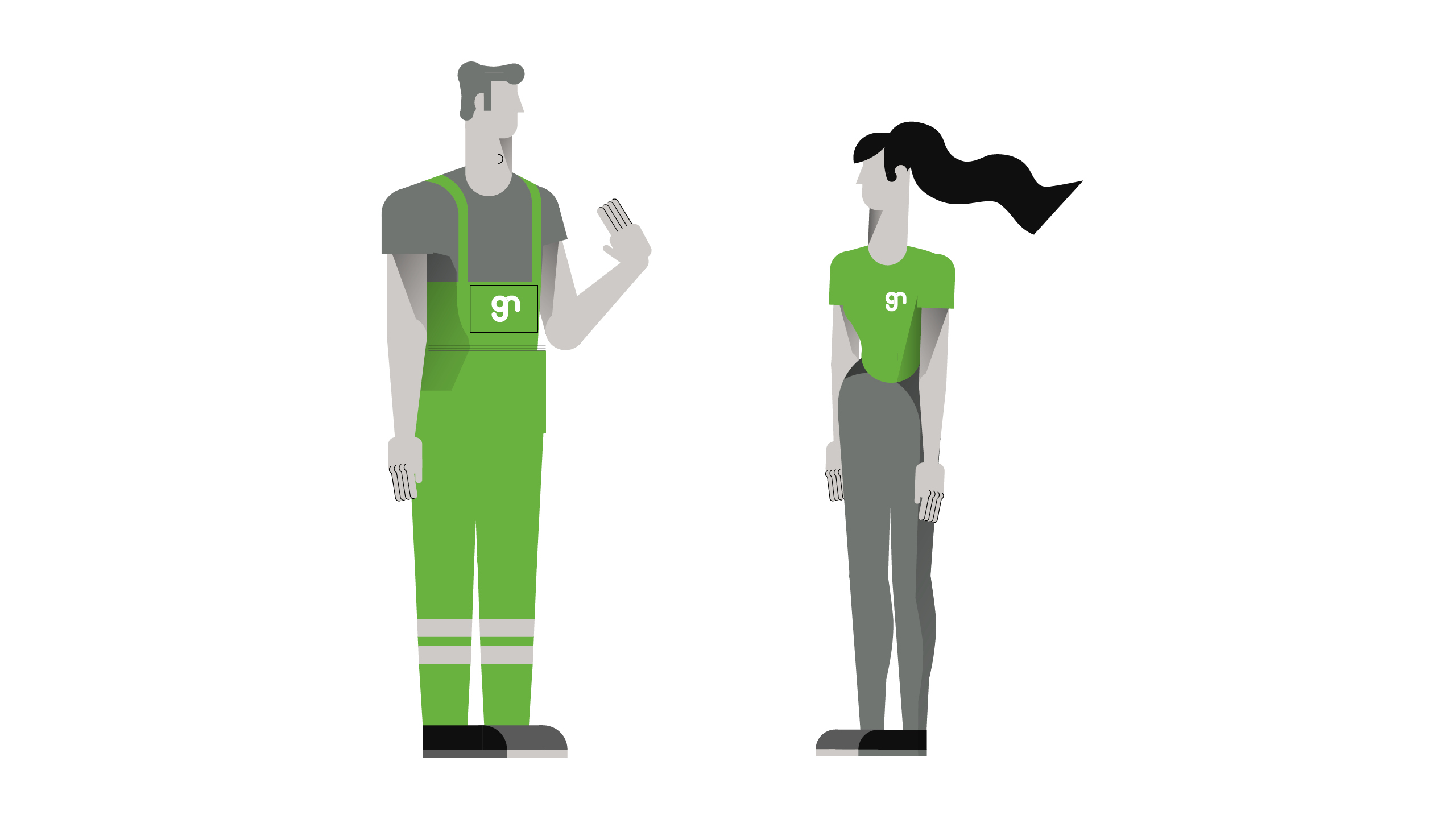
It is important to maintain a consistent level of detail for all additional symbols. Symbols can only work uniformly and coherently if we always follow the same degree of simplification. E.g. figures are represented without a face (eyes, nose, mouth) and hair - in a variant of detail torso or the whole character.
Infographics
The infographics system is based on a flexible isometric grid, original illustrations and specific gradient colours. Isometric elements can be freely assembled and combined or layered. This offers an infinite number of possibilities for graphic representation of data and contexts. The linear illustrations then complement the specific informative message in an original and engaging way.


Creation
When creating new elements, we pay attention to maintaining a uniform appearance. Here is a brief summary of some of the rules:

Isometric
Isometric spatial illustrations work on the basis of a tile grid, allowing us to arbitrarily combine and layer elements into more complex compositions. We build cities, floors, streets and supply individual houses, trees and figures - all in a 45° perspective.

Linear
When the message is not expressed in data but with a statement, it is appropriate to use linear illustrations. Their aesthetics are exactly the same as in the isometric example. However, the environment in which the figures and objects are embedded is not in perspective, but in a conventional flat view.

Colour
Each illustrated element must adhere to the company's colour scheme, plus an additional shade of brown (HEX # 814a1f). Only then can the individual elements be arbitrarily assembled and combined so that the resulting composition is coherent. In addition, gradient effects can be applied in all shades. When creating new elements, we use a set of existing examples.

Level of detail
It is important to maintain a consistent level of detail for all info-graphics. Illustrations can only work uniformly and coherently if we always follow the same limits for simplification. E.g. the figures are depicted without a face (eyes, nose, mouth) and hair – in both isometric and linear variants.
Photography
We classify photographs for marketing purposes into three basic groups according to subject: ecology, technology and characters. Environmental images focus on inanimate natural objects and flora in wide shots and detail. The subject of technology is communicated with textures and shots from real professional environments. The portraits are mainly of members of the GasNet team.
Ecology
Aerial views of nature, greenery and forests. Paths, roads, rivers, streams are all significant motifs suggesting interconnection, flow, and energy.
Views of natural scenery, wide-angle shots, positive emotions. Connected paths forming a network, are reminiscent of interconnection and flow. The image should not end in a borderless, white sky until lost; it must have clear borders.
The detail of an organic, natural pattern transforming into an abstract plane. Leaf structures point to the interconnection of energies.
Natural elements photographed without any surrounding context, at first glance forming almost abstract patterns.
Technology
Aerial shots of a city that capture dynamic atmospheres. Crossroads, busy roads, streets. Long exposure gives the photo a timelessness and emphasizes movement. Green should be the dominant colour for tinted photos.
Structures of gas pipelines, pipes, valves, meter dials and technical elements depicted in a pure minimalist aesthetic. No interfering backgrounds, no safety warnings in colour that would interfere with the main motif.
Images of a real-life work environment with credible work activities. Natural and un-stylized, but professional, high-quality images.
Credible images of work with an emphasis on high tech accessories, routine work with state-of-the-art technology and personal protection equipment as a matter of course.
Characters
Natural, trustworthy faces. Men and women of different ages. Frontal views, without unnatural angles.
Appealing and natural facial expressions. Slight, genuine smiles, without stylized grimaces.
For studio photography, we choose a monochrome background of neutral muted light colours. A grey range is ideal for print and online use.
When shooting outdoors, we choose shots without brightly coloured contrasting backgrounds. We will ensure sufficient background blurring so that it appears as unobtrusive as possible.
General principles
- Natural
We always choose natural light, contrast, angles, people and environments. Backgrounds are monochrome or blurred, and in neutral colours. The environment should be identifiably as local. - Quality
We pay attention to the sharpness, lighting, composition and resolution of all photos. Very high image resolution is required, especially for print. The image should have clear boundaries and should not fade into the edges. - Communication
Connection, flow, energy, warmth, sustainability, credibility, professionalism, high tech. Images without people should border on abstract patterns - atmospheric scenes with a positive vibe.
A stylized image in the style of a candid snapshot, not a portrait. Unprofessional lighting and distracting backgrounds – as a result, the figure cannot be easily optically separated from the background.
Very dark images with insufficient lighting and unsuitable atmospheres. A solid black background is not recommended for standard portraits.
We avoid the use of images with an inappropriate degree of undress or inappropriate model expressions. The image must be tasteful and uncontroversial.
As the company operates exclusively in the Czech Republic, images that clearly do not show local reality are not suitable for use.
Unbalanced compositions, blurred image boundaries. Theses images are completely unsuitable for use in a layout with a white background.
Nature shots should focus primarily on flora and inanimate objects on a more abstract level. General, neutral photographs with an environmental subtext are desirable.
Layout
Photo & text
Horizontal
A composition combining a photograph with a short text / claim. Where appropriate, we work with a white frame according to the grid indicated below. Where a white frame would not be suitable, we work with a white box inside the image. Layouts are flexible within the grid.


Vertical
Vertical layouts are subject to the same principles as horizontal layouts. However, the white frame here can be extended up to the lower third of the entire format, thus limiting the space for photography to the remaining upper 2/3 of the format.


Unconventional formats
Compositions of any formats can be compiled, provided the above-mentioned principles are followed. In general, the more space a format provides, the easier it is to make a layout. Below are some examples of small layouts that can be used online and in print.


Text grids
1 column
The text and font sizes structured in this way apply to all types of layout; not only for presentable advertorial content, but also for internally processed texts.
In the case of internal texts, such as a letter on letterhead, of course, the Fieldwork font can be replaced by an alternative font (Segoe UI), but all other specifications remain unchanged; maintenance of the buffer zone, font size and text alignment on the banner.


2 columns


3 columns


Optical divider
In layouts on solid colour background, we can use a small line in white/black or corporate green (depending on the background). This line is placed as a divider between title (introduction) part and body text part. Or it can even serve as an optical support for single titles.
Here we can see the optical divider used in context.

Topics
Reliability
We are a critical part of state infrastructure. Every day, we ensure a reliable and secure supply of natural gas to millions of people. That is our mission.
Keywords: #reliability #safety #tradition #responsibility
Safety
There is nothing more important to us than safety. Our employees’ health always comes first.
Keywords: # safety #protection #emergency
Professionalism
We take our work really seriously; it is our mission. Our people are true professionals, responsible, precise and determined, with their hearts in the right place.
Keywords: #professionalism #expertise
Respect
We are aware of the value of life and the need to protect the environment. Environment and sustainability are at the heart of our activities and attitudes. We respect and help where we work.
Keywords: #environment #respect #biofuel
Connection
We are always close to our customers. We connect most of the homes and businesses in the Czech Republic.
Keywords: #trust #relationship #support
Technology
Thanks to digitization and state-of-the-art technologies, we manage and monitor the largest gas infrastructure in the Czech Republic.
Keywords: #digitalization #monitoring #management #hi-tech
Stories
Reliability, safety and respect are the cornerstones of our business. With our new brand, we give these words real meaning through the faces and stories of people, professionals from the GasNet group.
"GasNet is an efficient, reliable and professional distributor of natural gas." This original slogan has been recently replaced by a comprehensive marketing strategy. Through specific stories of real people, we show that these words are also the daily life of GasNet.


Copywriting
Principles
- Writing and pronunciation
The morphology of GasNet is not a loanword and it is read as it is written: GasNet [gasnet].
We pronounce as one word [gasnet] with a clear [s], i.e. not [gaznet]. We also clearly pronounce vowels, i.e. not [g'snet] or [g'sn't].
We write the name of the company exclusively as GasNet, GasNet group, or companies of the GasNet group, or GasNet, s.r.o. In text, if possible, we always write the name in bold. - We
We are proud of GasNet. We talk about it (but not exclusively) in the first person plural rather than in the third person singular. So "Reliable supply is a priority for us" rather than "Reliable supply is a priority for GasNet" - Slang
Conversational expressions and a familiar tone downplay any message. We try to avoid that. We do not use terms like "pros", "gimmicks" or "fighters", but "professionals", "experts", "top".
Sample
Here is a specific example of a message in the form of recruitment advertising.

Millions of people rely on me every day
You don't have to be a businessman to do something big and important. Jirka manages gas supplies for 185,000 homes and businesses from our control room.Join us at GasNet and use our cutting-edge technology for meaningful, useful work.
GasNet People: Reliability | Safety | Respect
+420 123 456 | hr@gasnet.cz
GASNET.CZ
Wayfinding system
Interior
Indoor signs reflect company colours and pictograms created inline with the corporate identity. These pictograms are further supplemented by texts that indicate specific locations.Objects related to gas infrastructure presented as artefacts or sculptures, may be installed on the premises.For most markings, production from cut foil is preferred, in some places it can be supplemented with symbols composed of 3D material.
Full presentation
Exterior
Outdoor signs offer a range of possible solutions. In general, we prefer those which give the logo a third dimension by actual layering of real material, instead of the mere effect of shadow through overlapping layers.
Webdesign
Styleguide
The web design style guide is used to adapt new visual identities in electronic applications. It is a document describing the design principles of all individual elements and interactions that make up the web interface.
View stylesheet


Application
Motion
Text in video
The spatial character of the logo naturally lends itself to motion. Here is an example of working with the logo, text and divides in video.
Text frame
A variable graphic element in video is a black text box that carries captions in white of a person / place / situation. This simple box is always located above the lower right edge of the screen. It consists of a main title, a subtitle and the GasNet logo.
Frame to download

Frame
The gap between the frame and the bottom edge of the video format must not be significantly larger or smaller than the height of the box carrying the main caption. The secondary box, bearing the subtitle, is half the height and the box with the logo is a square derived from the height of the main box. These two boxes have 50% transparency. The height of the main box is determined by the height of the text; its width must not exceed half of the video horizontal formats.

Text
The texts in the video are always in the Fieldwork font aligned to the left banner. The main title is Regular type-facet, size 55 b (for HD format) and the subtitle is DemiBold, capitals size 25b (for HD format). Text sizes vary according to format and legibility, but the buffer zone of one third of the frame height is always observed. Ideally, we will keep a significantly larger buffer at the right edge, if the format allows.
Logo animation
Simple and effective logo animation can also function as the beginning and end of company presentations.
Download animations
Opening
Closing
Download
Logo-set
Logo variants
basic logo variant
Versions: with gradient, without gradient
Colours: green, white, black
Formats: SVG, EPS, JPG, PNG, PDF
vertical logo variant
Versions: with gradient, without gradient
Colours: green, white, black
Formats: SVG, EPS, JPG, PNG, PDF
horizontal logo variant
Versions: with gradient, without gradient
Colours: green, white, black
Formats: SVG, EPS, JPG, PNG, PDF
Elementy loga
Animations
opening animation
Version: with gradient
Colours: green, white
Format: GIF
closing animation
Version: with gradient
Colours: green, white
Format: GIF
text frame
Text frame animation source file for placement in the video.
Format: Adobe After Effects


